Web and app designers vie for curating designs that are beneficial for their users. After all, who wouldn’t want digital product designs that can influence the user’s experience? So, though this may not be a chicken-and-egg question, it still is a trending one. What’s the best choice for designers, responsive design or adaptive design? Keep reading! Let’s find out the pros and cons of adaptive vs. responsive design in the context of performance and UX.
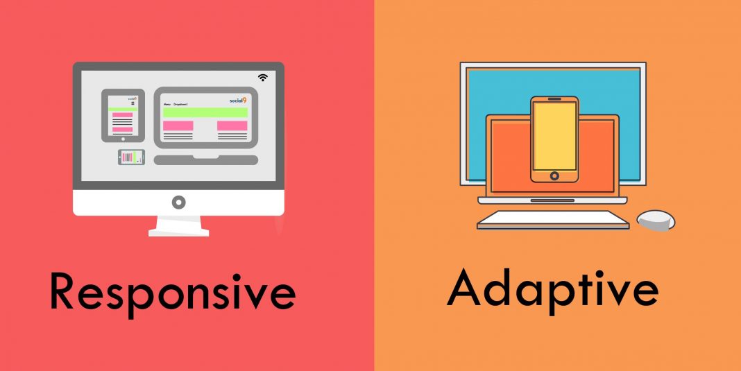
Adaptive Vs. Responsive Design
There are many thoughts around responsive design and adaptive design. It may sound confusing so let’s look at some explicit differences.
- Responsive Design
The term “responsive design” was coined by developer Ethan Marcotte. What does it mean when someone says they have a responsive website? Firstly, responsive design responds to changes in browser width. How? Well, it automatically fine-tunes the placement of design elements. For example, if you open a responsive site on the desktop, it will fit the browser window. Plus, the content will move and dynamically arrange itself optimally for the window. So, when one switches to a mobile phone, the process is automatic. Simply, the responsive design is straightforward. It features fluidity, which means that users can access any device seamlessly, be it a handheld device or a desktop.
2. Adaptive Design
Adaptive Web Design was coined by web designer Aaron Gustafson and is popularly known as the progressive enhancement of a website. Here’s the thing! Adaptive design has different fixed layouts that are created to adapt to the user’s screen size. As opposed to the responsive approach, it employs multiple sizes of a fixed design.
Ultimately, many new websites now use responsive design. So, when designing a layout that you wish to be responsive, you need to think of all the screens and devices that your target user may view it on. If you don’t take into consideration of the diverse screen sizes, the layout may resize poorly, resulting in poor UX.
Why Use Responsive Design?
The increased use of sites adopting the responsive approach can be attributed to the availability of themes accessible through CMS systems, such as Joomla, WordPress, and Drupal.
Responsive layouts are fluid. And, responsive designers can design with all layouts in mind. Though this can get complicated, an experienced designer will focus on creating a viewport for mid-resolution.
On the downsides:
- Responsive sites can suffer when it comes to speed.
- It requires more coding to ensure the site fits every screen.
However, responsive design enjoys a slight edge as one does not need to spend more time in site maintenance.
Responsive Web Design Examples
Let’s look at some cool responsive web design examples:
- Dropbox: It uses a fluid grid and flexible visuals that stand out. Plus, one can see the font color change to blend with the background color when transcending from desktop to handheld devices.
- Shopify: Yet, another example is Shopify. The user experience created is consistent across all devices. Plus, they use image carousels to show off their customers, and they still have maintained page load speed below five seconds. Now, that’s cool!
- Slack: Slack’s website has a flexible grid that quickly adapts to viewports of diverse sizes and shapes. And, the site is convenient to use.
Why Use Adaptive Design?
For those who wish to try retrofitting an existing site to make it more mobile-friendly, an adaptive approach may help. It helps to take control of the design and development of multiple viewports.
So, typically one would begin with a low-resolution viewport and then work around it. Furthermore, if one wants to design an adaptive site from a scratch, that is fine too.
On the downsides:
- It can mean more work while designing and developing a site with adaptive for multiple viewports. Thus, it is better used for retrofitting.
Examples of Adaptive Web Design
Here are some exciting adaptive web design examples:
- Turkish Airlines: It offers users a choice between a desktop website, a mobile website, and a mobile app. The three different experiences are quite handy for booking a flight.
- IKEA: Another great example is IKEA’s mobile website. It uses an m-dot tailored version, which helps during product browsing.
- Adidas: Adidas offers its mobile visitors an m-dot site that replicates the desktop site, offering a suave experience.
The Final Word–Adaptive vs. Responsive Design
Any design approach must be centered around your audience’s needs. The key is to research your audience first and then look at solutions with a design approach. So, once you know what devices your audience tends to use to access the site, you’d have your answer to layout and content, and so on. In conclusion, choose an approach that can help you curate web design solutions that benefit your audience.
Wrapping Up
There is a lot that goes into curating mind-boggling user experiences with the apt design approach. If you aren’t sure where to begin, talk to a proficient web design partner such as Cosmic Technologies. We can help you create a cohesive and consistent user experience. Let’s talk.